Smart companies never settle. They are constantly searching for ways to improve their service, provide their users with additional value, and grow intelligently along with their audience. This sometimes necessitates making changes to many highly visible parts of their business, whether it be swapping out old language for new, making functional changes to the core business, or altering their visual aesthetic to better communicate their brand or simplify the use of their website.
As you may have noticed, Ebyline.com recently underwent a bit of an aesthetic makeover. As with anything that affects our users, changes were made based on carefully accumulated information and a deep belief that they’ll improve the overall quality of our service
Through this process we used a number of simple tools to get the information we needed to make intelligent, functional changes to the site that will ultimately make Ebyline as easy to use as possible. When leveraged properly, these five tools can dramatically increase the knowledge you have at your disposal, and help optimize your website’s user experience!
Want to jump straight to your favorite tool? Click here: Google Analytics – Marketo – Qualaroo – Crazy Egg – Survey Monkey
 Google Analytics
Google Analytics is a powerful service offered by Google that provides you with detailed information on your website’s traffic, traffic sources, conversion rates, and sales. It has services aimed at both desktop and mobile sites, including applications. The multi-channel funnels service allows users to see how their overall marketing efforts are working to bring people to the site, and allow a deeper view of potential ways to improve conversion rates. If you’re concerned about potential costs, don’t be. The basic service is offered free of charge, while a premium service is available for a reasonable fee.
Google Analytics gave us the information we needed to make the intelligent changes to our interface that would clearly serve our users needs. This started by determining our registration conversion, and seeing where there was some room for improvement. To determine conversion rates, we set-up goals in Google Analytics to measure conversions on all our sign-up pages.

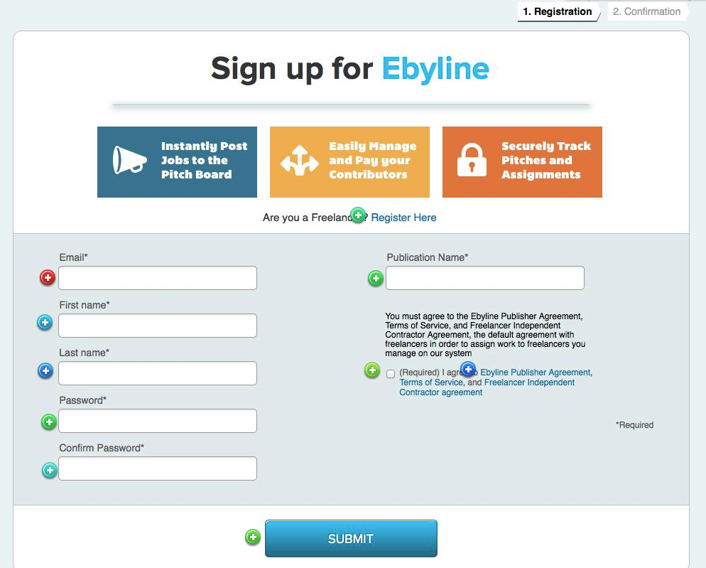
Our old sign-up page
Navigation paths revealed that freelancers were going to the wrong registration page primarily due to the call to action on our homepage aimed at editors. The homepage was text heavy, and had many different calls to action that confused the user. By mapping out our overall user funnel and identifying the core problem based on the information we received from Google Analytics, we were able to see where visitors were dropping off and make changes accordingly.

The registration page and homepage are now integrated
The new webpage has a number of advantages over the old one. It’s cleaner, simpler, and more concise, while providing a clear call to action. The registration process has been simplified, and the color scheme has been lightened to improve overall visibility. These changes will impact overall conversion rates and provide a clearer path to registration for potential users.
Marketo
While Google Analytics gave us an overview of our visitors and some hints on how to better simplify the registration process and improve our conversion rates, Marketo gave us the details we needed on how every user interacted with the site.
Marketo is a marketing software automation company that provides a number of services for potential clients, from lead management to sales insights and revenue analytics. They also have a wealth of resources aimed at optimizing social media lead generation and integrating social strategies into your overall inbound marketing strategy. Marketo offers three basic packages for prospective users, Spark, Standard, and Select, each tailored to the unique needs of your organization.
Using Marketo’s services, we created a group of ideal customers and researched their behavior. This included how they found Ebyline, what paths they took to register, and every activity they performed after they signed up. One of the primary activities on the site is the creation of new proposals, and we wanted to make that service as valuable as possible to our users.

Our original proposal form
One feature we use quite often is trigger campaigns. These campaigns alert our team when users perform a specific action we want to know about such as clicking a link, visiting a page, creating a project or making a purchase. These alerts allowed us to look into each user and find out why they performed that action and find ways to fine tune the flow. Based on the data from Marketo, we were able to design a better and smarter flow for creating new proposals.

The new form focuses on simplicity and ease of use while maximizing the likelihood of the right parties finding one another.
Qualaroo
Qualaroo is a powerful set of do-it-yourself tools that allows savvy marketers to interact directly with their audience, and provides a number of customer engagement forms, feedback questions, and other materials that provide maximum insight on your user base. Qualaroo offers two primary product suites, Qualaroo Insights and Qualaroo Convert. Insights focuses on providing business owners with the information they need to make better decisions through targeted questions and by connecting user response with their actual behavior, while Convert gets direct feedback from your consumers immediately upon their interactions with your landing page.
Qualaroo’s tools allowed us to get a deeper view of what our users were looking for, and the information we got from survey responses directly impacted our design decisions.

The survey results led to a number of interesting conclusions. Freelancers now have the ability to add a headshot to their profile, as our users suggested that it would aid with hiring decisions. Freelancers felt similarly, and asked for a profile photo feature when asked.
Crazy Egg
 Crazy Egg
Understanding where a visitor is looking is a critical piece of information when designing an effective webpage. Crazy Egg’s powerful eye tracking technologies provide users with the information they need to make intelligent design decisions.
Web analytics tools provide you with a lot of “what,” but sometimes aren’t as effective when it comes to connecting the “what” with the “why.” Crazy Egg has four primary tools, a Heatmap, Scrollmap, Overlay, and Confetti tool that combine to more effectively show user behavior on your site, and give the insight you need to explain why users aren’t converting at high rates. Each tool has benefits, and a package is fairly inexpensive. Their Standard tracking plan is just $19/month, and they even have a 30-day free trial.
Our old sign up form
The tool we leveraged the most was Overlay, which shows where visitors are clicking and how many times they would click. We placed their tracking code on our sign up page to see visitor interaction on that page, and noticed a few interesting trends. While many of our users started the sign up form, there was a relatively high rate of drop off from the beginning of the form to the end. Even on a simple form like this, users were getting distracted during the sign up process and moved on to something else before finishing the form.
To address this problem, we’ve shortened the sign up form by going from 6 fields to 4, eliminating the fields for password confirmation and publication name.
SurveyMonkey
When you’re looking for answers, sometimes it’s as simple as asking the right questions. SurveyMonkey is the world’s most popular online survey tool, and it makes it incredibly easy to send free surveys, polls, and questionnaires to your user base. SurveyMonkey also provides you with survey questions and professional templates that make asking the right questions simpler than ever. If you’re doing some preliminary research and need to ask questions to the right audience, SurveyMonkey Audience is a pre-qualified group of responders ready to provide you with game-changing feedback.
We surveyed our users to get their feedback on the Pitch Board feature. While many surveys tend to railroad respondents on a path that biases results, SurveyMonkey has a variety of tools that make your responses as insightful as possible. Their “skip logic” feature changes what question or page a respondent sees based on their previous answers, allowing us to tailor the survey towards different user cases and get a truly accurate result.

Based on the results, we changed the Pitch Board feature to be more user friendly by eliminating certain fields or making them not required. We also improved the lines of communication between freelancers and editors.
Bringing It Together
While each of these tools is powerful individually, by bringing them together it’s possible to achieve even greater results. Here’s how we combined different tools to bring an incredible set of positive changes to different parts of the site!
Homepage
Initially the homepage presented users with many options, forcing them to make immediate decisions about which category they fell into which could be somewhat subconsciously uncomfortable. Additionally, the color scheme made some elements difficult to see while great content points were slightly obscured.

Our original homepage
Google Analytics provided us with an overview of what our users were looking for, while Marketo established their primary behavior path when encountering the site for the first time. By using this information in combination with Crazy Egg’s heat mapping services, we were able to design a more open, appealing home page.

The new page!
By integrating the homepage and registration form, we were able to create one registration path for all user types and simplify their overall decision making process. We adjusted the positioning of the video and increased its size relative to the other content on the page, while simultaneously brightening it and using more appealing visuals. The content now focuses on content marketing publishers, and the client social proof matches our content marketing clients.
Navigation Bar
The original navigation bar focused on drop down menus that provided users with extensive options. These many options were leading to a degree of user confusion, resulting in conversion rates that could be improved.

Once again, Google Analytics, Marketo, and Crazy Egg gave us the required tools to make productive changes. The tiered drop down information and product matrix was removed in favor of a few simple, explanatory buttons. We pulled out the Login button and focused on making it easy for users to access their account from Ebyline’s homepage. The navigation bar now has a single path to all product tiers, maximizing ease of use.

The simplified bar has led to a significant increase in conversion rate
How It Works Page
Our how it works page provided users with an enormous amount of information, including an overview of the company and a number of our key performance indicators. While this taught our users a lot about the site, it didn’t focus on their unique needs and led to information overload.
Google Analytics and Marketo taught us about the ways in which users interacted with the page, while SurveyMonkey and Qualaroo gave us the surveying power we needed to understand what our users were looking for. As we continue to gain a deeper understanding of the information our prospects are looking for, this will likely be a page that iterates and changes over time.


The new how it works is a significant visual departure. Rather than segmenting our users into different cases with multiple pages and burying them in statistics, we focused on building a single long-form page that provided visitors with key information. The page now flows more naturally from top to bottom, and discusses the value we provide to users rather than corporate details. This more personal style of communication connects with the contact button at the bottom of the form.
About Us
Many companies struggle with clearly articulating the value that they provide to users through their about page. Our initial page focused on overall company information and provided news points that gave additional credibility. Only text bios for our founders were provided.
The information we gleaned from our many tools pointed us in a clear direction. Freelance writers and individuals were interested in learning more about the value we intended to provide, and wanted to see a more personal side of the company. By positioning our About Us section around content marketing and focusing on publishers we maximized interest, while a more in depth section on the Ebyline team took potential users behind the scenes and put a relatable face on our work.
Anyone have similar experiences with these tools? Let us know below.