What’s the last thing that stands between a lead and a sale, at least online? An ecommerce product page. You might not think that the design of a product page matters all that much, but it can be the difference between getting a person to take the final steps and make a purchase and having that person close out the tab and run away.
If your ecommerce product pages aren’t performing as well as you’d like them to, or people just aren’t buying, it could be the design. Improve the way your product pages look and function by following these tips.
10 Ecommerce Product Page Design Tips
1. Keep Your Ecommerce Product Page Clean & Uncluttered
While you do have a lot of information to share with customers through a product page, it’s best to keep the overall design and appearance of the page clean, simple, and uncluttered.
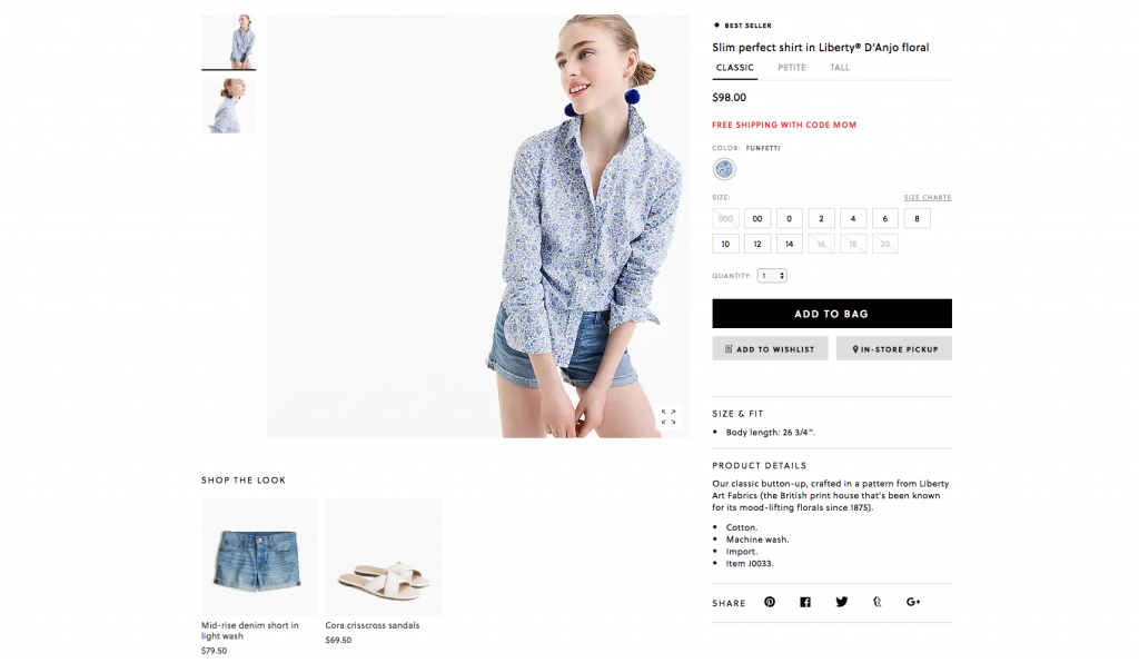
J.Crew provides a few examples of clean and simple product pages. For example, on the product page for a women’s button-up shirt, navigation moves from left to right. It’s easy to find the information you need about the sizing and fit of the shirt, as well as to make a decision about what to do about it (buy it, put it on your wish list, find it in a store).

2. Photos Are Worth 1,000 Words
Photos really have to do a lot of the talking when people shop online. Since a customer can’t touch or pick up the item, it’s up to the pictures of it to give a shopper a good idea of what it looks like from all angles.
Zappos does a great job of using photos to show its products from all angles. For example, the online store feature pictures of a pair of Superga sneakers from the top, sides, bottom, and front.

3. Tell a Story
The copy you use on a product page should really bring the product to life for a customer. One way to do that is by telling a story through the description.
For example, Boden, a clothing company based in Great Britain, tells a story in a description for women’s dress shoes. You learn that the shoes look great but don’t wreck your feet.

4. Optimize Your Text
Remember, a lot of customers are likely to find your ecommerce product page by doing searches. For that reason, it’s important to keep SEO front and center when creating and designing the page.
One way to do that is to use keywords throughout the text and meta descriptions. For example, Benjamin Moore’s Aura Bath & Spa paint appears on the first page of results for a search using the phrase “best bathroom paint.” In the source of the page, “bathroom paint” is among the keywords listed. The phrase also appears on the page and in the meta title.

5. Include Product/Customer Reviews
When people shop online, they’re putting a lot of trust in a brand. They can’t see the product IRL before buying, so they need to depend on the information on the product page.
One way to build trust with shoppers and put their minds at ease is to include reviews from customers who have purchased or used the product on the page. For example, Amazon allows reviews on its products. But it also goes one step further.
If a person has purchased a product through Amazon and reviews it, the review is labeled with “verified purchase” to show that the reviewer does actually own the item in question. For example, more than half of the reviews for a tomato fertilizer on the site come from verified purchases.

6. Feel the Need for Speed
Photos, videos, and what have you can really slow down a site. When designing an ecommerce product page, it’s super important that it loads quickly. No one wants to wait for photos of a pair of shorts or a lawnmower to load.
One retailer that’s done a great job of creating super-fast-loading product pages is Nordstrom. For example, the page for a lipstick from Clinique loads in the blink of an eye, even though it’s full of images and other details.

7. Include a Video
Videos can really bring a product to life for a shopper, letting them see how they can use it in real life, or how the product moves and functions when a person is using it.
Everlane includes a product video for each item it sells, such as its newly released “Day Glove” shoes. The video lets people see how the shoes fit the foot when someone’s walking.

8. Put Customers at Ease
Let’s jump back to the issue of trust. Along with wanting to confirm that a product works as it claims to work, or is as good as it claims to be, customers want to verify that your brand and company is one they can trust.
Trust is critical online. For example, when a company that specializes in A/B testing ran a 30-day test comparing the results of a page that read “Authorized Dealer Site” vs “Never Beaten on Price” for a watch, the page that read “Authorized Dealer Site” led to nearly double the number of sales.
There are other ways to create trust with your customers and put them at ease. For example, you can offer a satisfaction guarantee, so that people know they can return an item if they’re not happy with it. LL Bean includes a guarantee for all of its products. Athleta, a brand of women’s workout/active clothing, has what it calls a “Give It a Workout Guarantee.” If the gear doesn’t meet a person’s expectations, they can return it for free, even after wearing or using it.

9. Create a Sense of Urgency
Sometimes, customers don’t rush to make purchases because they don’t think they need to. The item is nowhere close to selling out.
When designing ecommerce product pages, it’s up to you to spur a customer to action by producing a sense of urgency. For example, when you search for hotels on Expedia, the product page tells you how many rooms are left at a certain price, and how many people are looking at or booking rooms at certain properties. The message is clear: Act fast or you’ll miss out.

10. Include a Call to Action
OK, people have found your product page, and they’ve put items into their carts. Now what?
Ideally, the page should guide the shopper to the cart, and towards checkout. An easy way to do that is to have a pop-up appear after a person adds an item to their cart. On West Elm, adding something to the cart means that a person is presented with three options in a pop-up: Checkout, Keep Shopping, or Express Checkout.
Your brand’s ecommerce product page shouldn’t be a barrier that gets in the way of a customer making a purchase. If you follow these design tips, the ecommerce product page will be what guides shoppers to the checkout (aka the finish line), rather than what turns them away.