Several behemoth news organizations—including The New York Times and MSNBC—have recently redesigned their websites in an effort to make them more mobile- and tablet-friendly. The new websites of The New York Times and MSNBC have some similarities—they both aim to create experiences more appropriate for mobile, tablet or both, albeit at different levels. They both embrace more white space, and perhaps more importantly, they both now put more emphasis on reader comments and communities. Brands can and should do the same for their blogs because whether you’re a publisher or a business, without readers or customers you have no business. Here are some simple takeaways from the redesigns that brands and agencies can apply to their own content marketing initiatives.
Mobile or responsive?
Joseph Casabona, a Web developer based in northeast Pennsylvania and part-time faculty member in the computer sciences department at the University of Scranton, told Ebyline that he thinks MSNBC “gets it” when it comes to how people are consuming the news now.
MSNBC Redesign
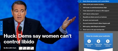
MSNBC.com was redesigned from scratch and is fully responsive (which means the layout changes for the best user experience based on the screen size you’re using). The homepage features the top 10 trending stories (while The New York Times keeps at least 12 stories above the fold), and tells people how they can get involved:
- Explore, which provides a drop-down menu allowing people to search content by topic;
- Watch, a list of MSNBC shows with links to their responsive websites and video segments;
- Join In, which lets you follow MSNBC shows, topics, organizations and people; and
- Speak Out, which includes a poll, related story, and allows people to create their own groups and join in, and share via social networks.

MSNBC Speakout
Casabona said that the MSNBC.com redesign is “absolutely gorgeous,” but perhaps it’s a bit too rich: he said it took six seconds for a 3.1 MB page to load on his 4G connection.
“It does a really great job of determining breakpoints, scales nicely and doesn’t hide any content. Overall, it’s a really fantastic redesign,” he said, adding that both MSNBC and The New York Times sites break when JavaScript is disabled.
The biggest changes to the look of NYTimes.com aren’t on the homepage—except for added white space and a crisper layout it’s pretty similar—but on the article pages, which now include a ribbon of related stories on top, including native ads dubbed Paid Posts by the Grey Lady.

NYTimes.com Home Page
Conversation-focused
Most notably, The Times has moved its comments to a separate scrollable box to the right of articles, putting an increased emphasis on what readers have to say.
Adam Lehman, founder of The Wonder Jam, said that both media outlets encourage readers to get involved in conversation, and brands can learn from that.

NYTimes.com Article Page
“In an age where clicks equal eyeballs and eyeballs equal advertising dollars, driving people into continued engagement in discussion forums is a fantastic place to house the conversations. Brands can learn from this, and they can host the conversation. One of MSNBC.com’s most engaging discussion boards is titled ‘Creation vs Evolution.’ Brands need to take courage, stand up and engage their audience in discussion,” he told Ebyline.
When it comes to The Times, Casabona said he doesn’t see much difference on the homepage, and that he wouldn’t recommend having a different design for the homepage and article pages. NYTimes.com still isn’t fully responsive, and mobile devices still direct users to mobile.nytimes.com, he noted.
“If they are going to do a redesign, responsive should be the way to go so there is site consistency. I do like the article pages. There is really great focus on just the content,” adding that you can keep scrolling and don’t have to hit “previous,” “next” anymore.
In a Jan. 8 article on Mashable, Ian Adelman, director of digital design for The Times, emphasized that the newspaper was really focusing on the tablet experience with its redesign.
“We really kind of took the fundamental position that this experience was made to be used on touch devices. In a world where most of us still sit at our desktop computers and use a mouse to point, it was an important choice to say this is going to work really well on a tablet,” he told Mashable.
Emphasis on headlines
Lehman also explained that both redesigns give more prominence to top headlines.
“Headlines sell and drive visitors to deeper into the site. MSNBC.com has a continually updated top 10 article headlines while NYTimes.com keeps 12 or more headlines above-the-fold on the homepage. Brands can follow suit by keeping copy to a minimum, especially on a homepage. As I work with businesses, so many are tempted to say too much and write paragraph after paragraph,” he said.
Overall, according to Casabona, MSNBC did a better job with the redesign, “creating a plan and executing it really well.”
Are social media buttons necessary?
Casabona, who wrote “Responsive Design With WordPress” points to an interesting article that suggests using social media buttons on websites is actually a bad thing. The theory: if people want to share an article, they will, regardless of whether you stick a button in front of them.
“That said, if people are using the share buttons frequently, it might be worth having,” he said, adding that it’s important to talk to your users to find out what features they like.
Lehman concluded that scannable, simple content is the way to go for both publishers and brands.
“Scannable, simple content built for engagement on-site and on-social-network isn’t just a coming trend; it’s already here. The tipping point has been hit, and it’s here to stay.”